Saturday, June 20, 2009
Happy Father's Day
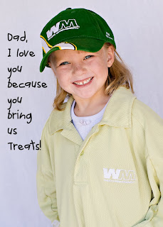
I can't believe how fast the summer is flying by! It's Father's day already! I had some fun ideas for Nath this year so thought I'd share them with you. I had this picture ordered as a puzzle from Shutterfly. It turned out really cute!
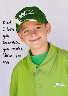
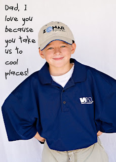
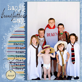
Then I took the Kids over to Liz Farnsworth. She is my sister's neighbor and also an amazing photographer! You can check her out at http://redbucketphotography.blogspot.com She took the following pictures for me of the kids dressed up in their dad's work stuff. They turned out super cute.
This is my oldest son.
This boy #2.
This is boy #3.
This is our little girl.
This our baby, boy #4.
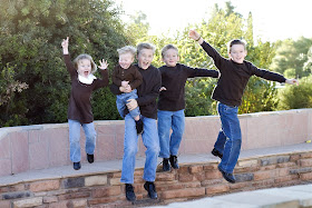
I also asked Liz to take one of all the kids. I had this one printed as an 8x10.
Adding Text to a photo is super easy! Just open your picture, and drag it on to a new background the size that you want. Then click on the T icon in your tool bar, or just hit the T key and it will change the tool to type automatically. Then make sure you have a new layer selected, and place your cursor where you want the type to be. Check at the top of your tool bar to make sure the font and the color of the type is what you want, but don't worry, you can always change all of that afterwards. The type what you want. If it doesn't look right, highlight the text and change whatever you want, color, size, or font and it will change everything that is highlighted. You can also move it around by changing the tool to the move tool. To do that, hit the V key or click on the arrow icon that looks like an arrow pointing at a starburst in your tool bar. You can add drop shadows and bevel and emboss the letters by clicking on the circle-f icon at the bottom of the layers pallet. And you are done! There are all kinds of things you can do with text, but that is the simpified easy version. Next is a page I made for my dad with mine and my sister's kids in the picture.
I used several different techniques on this layout. But that tutorial will have to wait for another day.
I hope you all cherish the Father's and Grandfather's in your life. I certainly am blessed to have wonderful men close to me. Happy Father's Day!
Tuesday, June 16, 2009
Tuesday Tutorial
You mean I can create my own custom patterned paper? And it will look like Bazzill textured cardstock too? SWEET!
Yup! You can make your own custom paper to match your photos, or to match that cute digi paper you downloaded but the kit didn't come with every thing you wanted.
So here goes. There is a little difference between Photoshop CS2 and Photoshop Elements, but since most of you are using PSE, then I'll give the instructions for that program. I made a card as a sample to show you what you can create.
Open a new file in Photoshop by hitting Control + N. Make it the size you want. Usually 12x12. Mine is 5x7. The size doesn't matter. Maybe you want to make an extra kind of patterned paper for your photo mat or whatever. Make it the size you want. Next in PSE hit K to change the tool to the paint bucket tool. On the side is the color paint chip thingy. The one on top will be the color you fill the area with. Usually it is black and white. You can change it by clicking on the top chip. A color box will appear and you choose the color you want and hit OK. Then click somewhere in the middle of your document. It will fill the space with color. I chose blue. Here's mine.
Ok. Now comes the cool part. Did you go to www.brusheezy.com? They have some very cute patterns you can download for free. Once you have chosen some, you need to unzip the files. Now you are ready to go get one for your patterned paper. Hit control + O to open the file. Find your brusheezy file you want. Select it and hit OK. Next drag it on to your main document. I chose a flower swirly one. It looks like this:

The pattern is a little strong for me so I reduced the opacity to about 50%. Play with the slider above the layer's pallet to get the look you want. Another way to change the opacity is to set the blending mode to soft light. It's play time to figure out the look you like. Here's mine.

I like this but we aren't done. Now the Bazzill texture. Create a new adjustment layer>pattern>select dark coarse weave pattern from the Artist Surfaces Library>OK Now it's so dark that it covers everything. You need to reduce the opacity to about 40% and set the blending mode to Soft Light. After that I added text to my card. The font is Texas Hero
that I got free from www.dafont.com. I resized it using Control + T and reduced the opacity to about 75%. Then I added a drop shadow. It looks like this:

We are almost done. For all you scrappers, how many of you ink the edges of everything? I'm sure all of your hands are up, and if they aren't, you aren't being honest with yourself, or all I can say is 'Why not?' But since we are digi now, we can still get the inked edge look. Of course you can but inked edge kits from Scrap Girls, or Designer Digitals that are grungy and cool, but if you don't want to do that, just add a little dimention and color to the edges of your paper you can use the burn tool. It looks like a little hand that would be holding a pencil if there were a pencil in the hand. It might be hidden behind the dodge tool that looks like a lollipop. If you click on the tool, then right click on it, a dropdown menu will appear with all the tools that are "under" that one. Choose the Burn tool. Next you may want to change the brush size. You decide how big you want it to be. Mine is fairly small, less than 100 pixels. Make sure you are on the background layer. Click on a corner of your document. Now hold down the shift key while you click and drag your cursor down or across your document. This will keep a straight line. Release the mouse and start from the next corner holding the shift key down while you click and drag the next side. I think I reduced the opacity a little, but play with it and try to get the inked look you want. If you mess up, my favorite thing is Control+Z. It will undo the last step you just did. If you need to undo more than one step, go to Edit>Step Backward. These two are your digi scrappin' BFF! Here's what my finished card looked like:

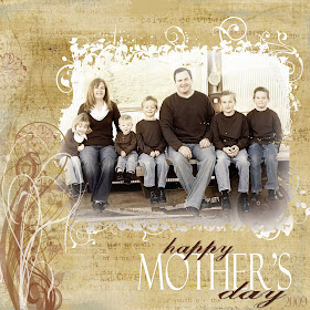
Now I can upload it to some online printing company like www.shutterfly.com and they will print my custom cards for cheap. Or I can save this and use it on a layout. I hope you had fun making your own custom paper. My favorite is making the texture like Bazzill paper. Next week we will play with layer masks. Here's a layout I made for my mom for mother's day using a clipping mask and a brush. Super easy!
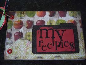
Oh yeah. I did finish my recipe card holder last week. I just never got a picture to post. So here it is. I am missing the bottom ring for it, but I got some today so it will be finished all the way today. The stamps came from my favorite stamp company Technique Tuesday.
Thanks for looking. Oh, and tell me if the tutorial was OK, too wordy, not wordy enough, easy to follow, etc. Bye!
Yup! You can make your own custom paper to match your photos, or to match that cute digi paper you downloaded but the kit didn't come with every thing you wanted.
So here goes. There is a little difference between Photoshop CS2 and Photoshop Elements, but since most of you are using PSE, then I'll give the instructions for that program. I made a card as a sample to show you what you can create.
Open a new file in Photoshop by hitting Control + N. Make it the size you want. Usually 12x12. Mine is 5x7. The size doesn't matter. Maybe you want to make an extra kind of patterned paper for your photo mat or whatever. Make it the size you want. Next in PSE hit K to change the tool to the paint bucket tool. On the side is the color paint chip thingy. The one on top will be the color you fill the area with. Usually it is black and white. You can change it by clicking on the top chip. A color box will appear and you choose the color you want and hit OK. Then click somewhere in the middle of your document. It will fill the space with color. I chose blue. Here's mine.
Ok. Now comes the cool part. Did you go to www.brusheezy.com? They have some very cute patterns you can download for free. Once you have chosen some, you need to unzip the files. Now you are ready to go get one for your patterned paper. Hit control + O to open the file. Find your brusheezy file you want. Select it and hit OK. Next drag it on to your main document. I chose a flower swirly one. It looks like this:
The pattern is a little strong for me so I reduced the opacity to about 50%. Play with the slider above the layer's pallet to get the look you want. Another way to change the opacity is to set the blending mode to soft light. It's play time to figure out the look you like. Here's mine.
I like this but we aren't done. Now the Bazzill texture. Create a new adjustment layer>pattern>select dark coarse weave pattern from the Artist Surfaces Library>OK Now it's so dark that it covers everything. You need to reduce the opacity to about 40% and set the blending mode to Soft Light. After that I added text to my card. The font is Texas Hero
that I got free from www.dafont.com. I resized it using Control + T and reduced the opacity to about 75%. Then I added a drop shadow. It looks like this:
We are almost done. For all you scrappers, how many of you ink the edges of everything? I'm sure all of your hands are up, and if they aren't, you aren't being honest with yourself, or all I can say is 'Why not?' But since we are digi now, we can still get the inked edge look. Of course you can but inked edge kits from Scrap Girls, or Designer Digitals that are grungy and cool, but if you don't want to do that, just add a little dimention and color to the edges of your paper you can use the burn tool. It looks like a little hand that would be holding a pencil if there were a pencil in the hand. It might be hidden behind the dodge tool that looks like a lollipop. If you click on the tool, then right click on it, a dropdown menu will appear with all the tools that are "under" that one. Choose the Burn tool. Next you may want to change the brush size. You decide how big you want it to be. Mine is fairly small, less than 100 pixels. Make sure you are on the background layer. Click on a corner of your document. Now hold down the shift key while you click and drag your cursor down or across your document. This will keep a straight line. Release the mouse and start from the next corner holding the shift key down while you click and drag the next side. I think I reduced the opacity a little, but play with it and try to get the inked look you want. If you mess up, my favorite thing is Control+Z. It will undo the last step you just did. If you need to undo more than one step, go to Edit>Step Backward. These two are your digi scrappin' BFF! Here's what my finished card looked like:
Now I can upload it to some online printing company like www.shutterfly.com and they will print my custom cards for cheap. Or I can save this and use it on a layout. I hope you had fun making your own custom paper. My favorite is making the texture like Bazzill paper. Next week we will play with layer masks. Here's a layout I made for my mom for mother's day using a clipping mask and a brush. Super easy!
Oh yeah. I did finish my recipe card holder last week. I just never got a picture to post. So here it is. I am missing the bottom ring for it, but I got some today so it will be finished all the way today. The stamps came from my favorite stamp company Technique Tuesday.
Thanks for looking. Oh, and tell me if the tutorial was OK, too wordy, not wordy enough, easy to follow, etc. Bye!
Eeezy Peezy
Eeezy Peezy, puddin' and pie
I canned some Apricots
and I didn't cry!
I ordered some apricots this weekend and canned some 12 quarts yesterday. Of all the fruits there are to can, I honestly think apricots are the easiest. Plus the smell and taste of them take me back to my childhood sitting in my aunt's apricot tree in Moccasin, AZ eating the fruit and dropping the pits on the ground. (She probably didn't like that part when it came time to mow.)
Ok here goes with how I did it. First wash the jars in warm soapy water, or run them through the dishwasher.
After the jars are all clean and shiny, they don't have to be dry, set them on your counter to get ready to fill them. Wash your fruit. I put mine in the sink in about 2 inches of water. Now it's time to start filling your jars. Cut each apricot in half, removing the pit and cut of any brown spots in case there are any. Now put each half in the jar face down. This allows you to pack more in than if they just fall in willy nilly. It looks like this when you are done filling them:
Next you need to make the syrup for the apricots. That entirely depends on how heavy you want the syrup. I did about 3-4 cups sugar to 6 cups of water. You can increase or decrease the sugar to your liking. Place the 6 cups of water on the stove in a saucepan. Heat to boiling. Turn down heat to a low simmer and slowly add the sugar stirring constantly to dissolve the sugar in the water. When that is all done, you might want to get a funnel. They sell them really cheap a Walmart. This just helps keep the sides of the jar clean. Add the sugar water to each jar filling up to the bottom of the rings in the jar. About 1 to 3/4 inches from the tippy top of the jar. It looks like this:
Next get your canner ready. I used a steam canner. You can also use a water bath canner. Fill it with water, place it on the stove, and turn the heat on. You want the water boiling, but not necessarily before you put your jars in. You also need another sauce pan with about 1 inch of water. Put the lids in the water on the stove and heat to boiling. Remove from heat and put the lids on the jars, then tighten the rings over the lids. Now you are ready to put your jars on or in your canner.
Yeah, now it's time to let them cook. I have to wait until steam starts shooting out the hole on the side of the canner then set the timer for 30 minutes. It takes a little while to get the steam up and going so be patient. Then when the time is done, turn off the heat and lift the lid off slowly, aiming the steam away from you. Steam burns are no fun! Now lift your jars off or out of the canner onto a towel on your counter. I use a jar lifter, but you can use your hot pads if you need to. You're done! Now you just have to wait 12-24 hours to let the jars finish cooking and seal the lids. Don't touch them! I know it's tempting but don't! Now you get to sit back and listen for that little pop that tells you the jar is sealed.
There are a few non-human made sounds in this world that are the absolute best! One near the very top is that little 'pop' sound the lid makes on your jar. A couple of my other favorites is the sound of Nath's truck engine turning off in the driveway because that means he's home. Another is the sound of the oven telling me my chocolate chip cookies are done. Nath would say the 'click-click' sound of a shotgun reloding is another one. I'm not sure I agree, but it is the absolute best home defence sound. In any language, that sound says "Watch out! I have a gun and things won't be pretty!"
Well that was a fun trip on tangent lane. Back to canning. Just take a look at these beauties!
Yeah! 12 more quarts to add to my pantry. Canning makes me happy!
I canned some Apricots
and I didn't cry!
I ordered some apricots this weekend and canned some 12 quarts yesterday. Of all the fruits there are to can, I honestly think apricots are the easiest. Plus the smell and taste of them take me back to my childhood sitting in my aunt's apricot tree in Moccasin, AZ eating the fruit and dropping the pits on the ground. (She probably didn't like that part when it came time to mow.)
Ok here goes with how I did it. First wash the jars in warm soapy water, or run them through the dishwasher.
After the jars are all clean and shiny, they don't have to be dry, set them on your counter to get ready to fill them. Wash your fruit. I put mine in the sink in about 2 inches of water. Now it's time to start filling your jars. Cut each apricot in half, removing the pit and cut of any brown spots in case there are any. Now put each half in the jar face down. This allows you to pack more in than if they just fall in willy nilly. It looks like this when you are done filling them:
Next you need to make the syrup for the apricots. That entirely depends on how heavy you want the syrup. I did about 3-4 cups sugar to 6 cups of water. You can increase or decrease the sugar to your liking. Place the 6 cups of water on the stove in a saucepan. Heat to boiling. Turn down heat to a low simmer and slowly add the sugar stirring constantly to dissolve the sugar in the water. When that is all done, you might want to get a funnel. They sell them really cheap a Walmart. This just helps keep the sides of the jar clean. Add the sugar water to each jar filling up to the bottom of the rings in the jar. About 1 to 3/4 inches from the tippy top of the jar. It looks like this:
Next get your canner ready. I used a steam canner. You can also use a water bath canner. Fill it with water, place it on the stove, and turn the heat on. You want the water boiling, but not necessarily before you put your jars in. You also need another sauce pan with about 1 inch of water. Put the lids in the water on the stove and heat to boiling. Remove from heat and put the lids on the jars, then tighten the rings over the lids. Now you are ready to put your jars on or in your canner.
Yeah, now it's time to let them cook. I have to wait until steam starts shooting out the hole on the side of the canner then set the timer for 30 minutes. It takes a little while to get the steam up and going so be patient. Then when the time is done, turn off the heat and lift the lid off slowly, aiming the steam away from you. Steam burns are no fun! Now lift your jars off or out of the canner onto a towel on your counter. I use a jar lifter, but you can use your hot pads if you need to. You're done! Now you just have to wait 12-24 hours to let the jars finish cooking and seal the lids. Don't touch them! I know it's tempting but don't! Now you get to sit back and listen for that little pop that tells you the jar is sealed.
There are a few non-human made sounds in this world that are the absolute best! One near the very top is that little 'pop' sound the lid makes on your jar. A couple of my other favorites is the sound of Nath's truck engine turning off in the driveway because that means he's home. Another is the sound of the oven telling me my chocolate chip cookies are done. Nath would say the 'click-click' sound of a shotgun reloding is another one. I'm not sure I agree, but it is the absolute best home defence sound. In any language, that sound says "Watch out! I have a gun and things won't be pretty!"
Well that was a fun trip on tangent lane. Back to canning. Just take a look at these beauties!
Yeah! 12 more quarts to add to my pantry. Canning makes me happy!
Monday, June 15, 2009
Yeah! Freebies!
Hey everyone, I found some super cute freebies and thought I'd pass them along. The first is a place I get a ton of fonts and doodlebats. It is actually addictive and I have to control myself before I load up my hardrive with tons of cute fonts. It is at www.dafont.com
The next place is one that has a lot of cute brushes and patterns to use in Photoshop. I'll use one in the Tuesday Tutorial to show you how to use it. It is at a place called www.brusheezy.com
Another place has a lot of free brushes, journaling blocks, and papers is at
www.designerdigitals.com You have to create a user account, which is free too. They have some super cute brush kits and frames for purchase. Look through it. It's definitely worth it.
My super favorite site is www.jessicasprague.com She has free kits, tutorials, and classes. Her site anniversary is next week and she's offering a free photo editing class. Here is the picture from her site:
Her classes are awesome and since it's free that's even better! I'll try to remind you to sign up next monday.
Happy scrapping with all your free stuff!
Tuesday, June 9, 2009
Tuesday Tutorial
Ok, I've decided to post a Tuesday Tutorial in Photoshop. It should be universal for Elements and CS versions.
Do you have vintage photos that are very low resolution and when you try to send them out to be printed you get that exclamation point telling you that the resolution is too low and if you get it printed it will be really grainy? You can easily fix that in Photoshop. I have this photo I found that I love of the Ranch we go to every summer. My great-grandparents purchased it years ago as a place for their descendents to gather and keep our family ties strong. What foresight and a huge gift to the future generations! Anyway it is super low resolution and I would like to print out a 5x7. Here's a copy of the origional.
Open Photoshop. Then open the photo you would like to resize. Next create a blank document the size you would like the finished photo to be. I made mine 5x7. This will work for any size, even 20x30. Next, using the move tool, drag the origional photo to your new document. It will probably look like this:
Since I don't want it that small, I hit control and t to activate the transform tool. You can also find this under the edit key in the toolbar. Click and drag one of the corners to resize the photo to fit the new document size. Click on the checkmark at the top to accept the change. It should look like this:
Now I like the size, but the coloring is a little faded and I'd like to intensify the blacks and whites. To do this click on Image > Adjustments > Levels This will open a new box with a histogram. Kind of what you might get on your camera to see what the lighting levels are. Anyway at the bottom of the histogram there are 3 little arrows pointing upwards. One side is for blacks, one in the middle, and one for whites. I click and drag the outside arrows in towards the middle a little. Play with it to get an image you like and hit OK to accept the change. Here's what mine looked like after adjusting the levels:
I like this but I want to add a little more. How many times do you come across a vintage photo and wish you knew who or what was in it? Or it was written on but it's faded or unledgable? There is another easy fix. Just add text to the photo. I used Texas Hero font from www.dafont.com It's free. Create a new layer. Click on the little T in your toolbar. This accesses the Type tool. Place your cursor on the photo where you want the text to be. Preferably in a spot where it won't cover up any of the important parts of the photo. Make sure the type color is what you want by checking the color box at the top of your toolbar. Then type your text. You can resize this and move it using the Transform tool like you used to resize the photo. Here's what mine looked like with text:
Since the text is a little darker than the photo, I'd like it to match a little better. To do this, make sure the text layer is highlighted. Above that is the opacity slider. Click on this and move the slider to about 75%. You can play with it to get the look you like. Here's what mine looked like:
Now I like to add border brushes alot. So I created a new layer. Click on the brush tool in your tool bar. Select the brush you like from your brush pallet. I think mine came from Scrap Girls. Place your cursor over the photo, making sure the color of the brush is what you want, and click. This will stamp your brush on the photo. Now access your transform tool by hitting Control and T. Resize the brush to frame your photo and click on the check mark to accept the change. I reduced the opacity to 75% like the text. Here is what the finished photo looks like:
Now my vintage photo is resized and labled and I can send it to my printer to be printed. Be sure and save your photo as a .psd file and a .jpeg file. Then send your .jpeg image to be printed. Enjoy!
Friday, June 5, 2009
Ok 2 more
Recipes
I made these recipe cards for my sister for Christmas last year. They are of the stuff I usually make. I did print copies for myself, but would't you know it, I still use my handwritten 3x5 cards and scraps of paper that I jotted the recipes down on. My goal today is to put them in a workable little cookbook that looks cute and will fit in my kitchen. I'll post pictures of it when I get it done. Enjoy!
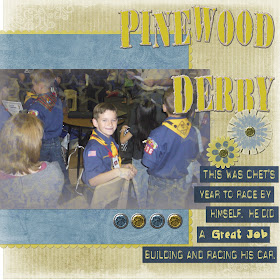
Pinewood Derby
I made this page as part of a template. The template idea came from this months Pagemaps from Becky Fleck. Ever since I took Jessica Sprague's class, I'm hooked on templates. They make design and assembling my pages soooo fast and easy. I usually get stumped on how to put the pages together and have to think about it for a while before the design comes together. Templates do away with all that. It's awesome!
Thursday, June 4, 2009
In the beginning...
After much pondering, I've decided to create my own blog. Mainly to post the things I have created, share some digi tips and samples, share recipes, and chronicle the life events. I'm very new at this blog thing, seen many, & follow a few. While I can't be the best at anything, I can try, and I can do my best at everything.
I did these pages as part of Jessica Spragues' Digi in Deep class. It was sooo awesome! I learned so much about Adobe Photoshop. I already know how to do a lot, but I haven't even scratched the surface. I hope to be able to share my journey as a Digi-scrapper. As soon as I figure out how to add files for you to download, I will post templates I have made, and maybe someday make my own digi kits to share.